De-Risking Software Investment with Usability Testing

By now, most of us have interacted with a doctor or nurse via video. COVID’s increased demands on medical professionals, combined with the need to prevent community transmission wherever possible, have accelerated an already-developing practice in the delivery of medical care: remote patient monitoring, or RPM.

Clinicians are presented with many technical service options designed to help bridge this “white space” between office visits. Grand Studio recently helped a large hospital network evaluate RPM vendor candidates for their RFI process, and usability testing offered an important set of criteria for this evaluation.

An emerging technology with profound usability implications

Care delivery modalities are often dependent on comprehension and adoption from both clinicians and patients, and our client understood this before we even had to suggest it. 

Clinicians can find themselves short on time and presented with a long list of biometric data to quickly assess and address. They may be accessing this data during busy clinic hours or between surgical procedures. Missing or misunderstanding something important can have serious implications for the patient’s wellbeing. Good interfaces will amplify clinician focus and mitigate their fatigue.

Patients may be familiar with digital technologies in general. Still, their ability to learn new interaction modes might be challenging when focusing their attention on coping with a health condition, especially a condition that may be new to them. Also, because many of these applications reside on a smartphone, it’s fair to assume that patients will be distracted when interacting with these interfaces.

We knew that context of use for all users would be critically important for our RPM solution. We decided that ranking the offerings against foundational and accepted usability rubrics would allow us to objectively assess how patients and clinicians might interact with this technology. These rankings would provide the decision-makers with a non-biased set of acceptance criteria to consider when choosing a technology partner.

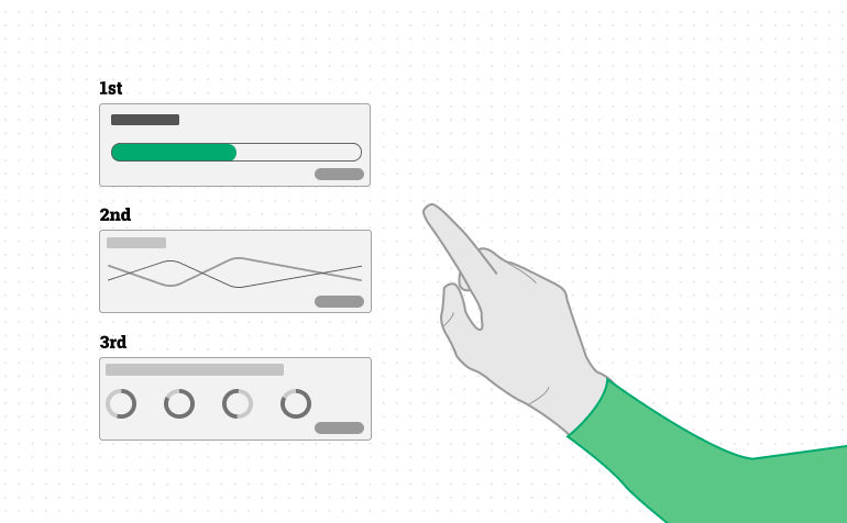
Step 1: Measure for fundamental heuristics

The market for RPM solutions is large and varied. As with any technology industry sector, some products are more mature than others. Additionally, some solutions were removed from consideration due to no fault of their own – they may be too narrow in their utility, too difficult to integrate with sibling platforms, or too general in their functionality.

We were presented with a collection of eleven vendor demo videos to evaluate. Grading on a curve, we scored their clinician-facing dashboards on commonly-accepted foundational rubrics.

  • Orientation, context, & wayfinding: How easy is it for users to find what they’re looking for?
  • Visual hierarchy & module differentiation: Is it clear that some things are more important than others?
  • System feedback/confirmation of action: Does the software validate the user’s actions?
  • Constructive failure & mistake recovery: What happens when a mistake is made? Is it easy to correct?
  • Affordances & interaction cues: Are interactive elements intuitive?
  • Language & terminology: Does the system present commonly accepted terms?
  • Three of the eleven scored very well, four were well below average, three were unacceptable, and one of the vendors was dismissed for other reasons.

Step 2: Test the finalists with real users

Testing software with real users is an essential part of any usability evaluation. No matter how much research you do and how deep your professional expertise is, you’ll never be able to consider real people’s comprehension patterns and work habits.

To simulate a real clinical scenario, we collaborated with our clinical partners to create a “dummy” data set with 100 fictional patient records. Each patient was given hypothetical biometric readings for blood pressure, blood glucose level, heart rate, respiration rate, weight, fall detection, and SPO2. We also mapped these patients to a small selection of conditions such as congestive heart failure, diabetes, and hypertension. Finally, each patient was assigned to one of eight doctors and one of five monitoring nurses.

The vendors were given these datasets, and the three finalists were asked to stand up a “sandbox” environment to support our task observation exercises.

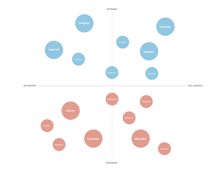
With the help of four monitoring nurses and one care coordinator, we asked these testers to execute a series of tasks within each finalist platform. Watching these users closely and interviewing them for feedback after completing the tasks yielded interesting and clear results.

The dashboards were evaluated on both general and feature-specific sets of heuristic criteria, allowing for some overlap with the first round of scoring. We measured the systems for the following feature-specific heuristics:

  • Dashboard clarity: Are the contents of the clinician dashboard presented in a scannable way?
  • Dashboard filter sets: Can the user reduce and refine the contents in the dashboard in an intuitive and content-relevant way?
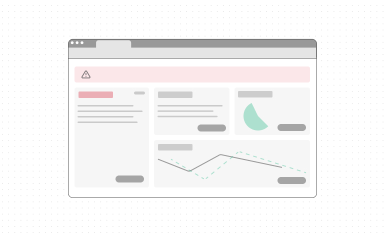
  • Patient details: Are these details clear and contextual, presenting the clinician with both a single measurement and trending data presentation?
  • Alert clearing & documentation: How easy is it to clear and document the clinical details when a patient’s biometrics are out of range?
  • Patient contact: Does the application provide functionality that enables text, phone, or video contact with the patient?
  • Clinician contact & collaboration: Does the platform support secure patient information sharing when a patient case requires escalation to a physician or collaboration with a nursing peer?
  • We also evaluated each of these offerings from a patient point of view, emphasizing program onboarding and user comprehension. 
  • Onboarding & guidance: Is the patient provided a clear and easy-to-use introduction to the software?
  • Next-best action clarity: As with clinicians, many of the patient’s tasks need to happen in sequence. Is that sequence clear?
  • Troubleshooting & support: How does the platform support users encountering technical challenges?
  • Biometric reading context: Patients are often confused by their biometric readings. Does the interface provide helpful context for understanding this information?
  • Wayfinding & signage: Is functionality clearly marked?
  • System feedback, reminder cues, & task validation: Patients also need confirmation of their actions in the application. They may also need scheduled reminders to take biometric readings. Is this functionality clear and flexible?
  • Clinician interaction functionality: Does the system provide a means of interaction between the patient and the clinician?
  • Physical space needed for devices: How much physical space does the kit take up? 
  • Portability of devices: Are the kit devices easy to carry, or is moving them challenging?
  • Device consistency & ease of connectivity: Do the kit devices and interfaces feel like they’re part of a suite of products? How easy is it to connect them with each other, personal smartphones, and the web?

Findings: One vendor scored much higher than the others

Remote Patient Monitoring offers a great example of the value of human-centered design. Each of the platforms we evaluated is built around technologies unavailable only a few years ago, technologies that will fundamentally change how healthcare is delivered in the near future. Many of the systems we evaluated failed to deliver that technology effectively because the interface and product design did not adequately support the real people, clinicians, and patients, who would use these new tools.

Given these stakes, the role of usability testing was elevated in prominence. The testing results were clear – one of the eleven vendors stood out as a clear favorite.

While the usability testing was only one important piece of the vendor evaluation process, it ensured that user needs were considered, helping to facilitate onboarding and adoption as a result.

The Power of Building Emotional Intelligence into Banking Experiences

Money is one of the most powerful drivers of decision-making in society. There are people who devote most of their lives to acquiring, growing, and keeping money. Money, by nature, is emotional to people at multiple stages in their lives. So when Grand Studio is looking to build products and services around something that touches the very core of people, it’s imperative on us to understand the emotional connections that exist there, as well as the responsibility we have to respond in kind. Whether we are designing products for personal banking, investments, or brand-new fintech opportunities, building up the emotional intelligence in our products can create stronger, more meaningful connections with customers, leading to long-term success for the brand.

What does it mean to have emotionally intelligent products?

Products and services with a high degree of emotional intelligence are ones that are born from an understanding of customer pain points (the inputs) and deliver solutions that spark more optimistic outcomes for customers (the outputs). They do not need to be overly complex nor hyper-personalized experiences to start. However, they do a fine job at easing pains, providing guidance when needed, offering options, and creating moments of delight. This is about creating empathy for our audiences and providing solutions to address their needs.

Banking on positive attitudes

The experiences we create in consumer banking need to feel tailor-fit for where consumers are in their financial journey in order to create those meaningful connections. Your audience might be afraid of low balances, trapped by debt, confused about saving, frustrated at small tasks like trying to wire someone else money, or looking for new opportunities to grow their wealth. Any of these scenarios point to pains that our solutions can address, but we can do so with a friendly experience. In the end, we are looking to help customers create the right type of changes in their financial lives that puts them on the path toward greater confidence.

Measuring emotional intelligence

It might seem difficult at first to connect user emotions to your existing products. A helpful activity I’ve found is to conduct field research to understand where your product is contributing to good feelings or perhaps may be falling short. Talk to your customers, get perspective on what your product is doing and how that makes them feel given their financial goals. This spectrum can help your customers identify where your product currently stands:

Grand Studio’s EI spectrum

This diagram sits on the spectrum of emotional states (based on optimism vs. pessimism) as well as the level of control afforded to users (full control vs. no control). If your product comes with a high sense of emotional intelligence, it would pass through areas of optimistic emotion for users. It will solve problems that hit users at their core, it will make them feel respected and delighted, and at best it can truly motivate them to behave in their own best interests.

Where do most products and services fit in?

The majority of products and services generally scratch the surface of gaining customer loyalty (represented by the bell curve). It all comes back to emotional intelligence, which understands what the product can provide, where the user is in their journey, and how a set of features can drive good behavior and positive feelings. To get to aspirational places like surprise, delight, and motivational — it requires extra focus on the combination of offerings and convenience that solve real needs for users. All of this creates long term engagement and customer loyalty.

What if these products fall short?

If however your product fails to inspire people, if it actually causes frustration and deterrence, then it is at risk of abandonment by your customer base. I would expect users to describe the impact of your product toward the bottom half of the spectrum:

Products that fall down here in the bell curve are generally met with indifference or considered not useful enough. The value proposition either doesn’t match the individual (wrong audience) or it doesn’t solve a real need (wrong value). This is often met with emotions like frustration, anxiety, and mistrust. In financial services, this can have very grave consequences when handling a customer’s money. This is often seen in support tickets and complaints. Fees for example are a big-ticket item. Inconveniencing the customer. Mishandling money. Timeliness. Any of these could easily propel a customer to switch to your competitor.

Measuring emotions leads to a plan with momentum

While most products that fail to connect generally fall into a zone of customer indifference or doubt, it’s helpful to get a reality check on where your product stands and ultimately determine how far you need to move your audience to get to a place of higher emotional intelligence.

This can create a roadmap for you in terms of where you are starting with your customers to gain their trust. From there, it is helpful to continue a cycle of customer learning as you provide solutions and test if they are generating the right emotional resonance with your audience.

How to build emotional intelligence into products

This is all about becoming aware of the potential impacts your product has on its audience and managing that responsibility appropriately. Fintech products today often try to do too much and could benefit from more focus in areas that create the right type of emotional responses from customers. There are several key areas to consider when creating a more rewarding user experience:

Start with the audience you have

Designing for everyone creates too much pressure to please everyone. In the world of finance, we need to be extra careful about not turning away customers and look to create experiences that inspire optimism. This starts with identifying your current audience before branching out to acquire a new one.

Find the value

This one is absolutely key. Do some quantitative and qualitative research with your audience to know more about their financial journeys, where there are common patterns, and what features could actually solve their problems — turning frustration and anxiety into more confidence-building emotions. Have them evaluate your current product along the emotional intelligence spectrum above. We want to ensure that your potential solutions can solve real needs for them.

Provide the right balance of user control

There is no right formula here as to what level of control will give users the confidence they need to feel financially secure and confident to conduct activities on your platform. This is something that needs to be tested and evaluated often to ensure you are receiving the right emotional responses from your audience. Perhaps there are parts of your experience you want to remove control and create more discovery, leading to surprise. Products that do this well often experiment with rewards and game-like experiences to keep users engaged.

Delight customers whenever you can

The nice, little touches can add up to big impacts for experience. Spend the extra effort to make users feel great about paying off a balance, successfully transferring money, or taking ownership over their financial future. Make it fun to interact with your product.

All that said, it’s worth considering your organization’s brand and tone. Messaging is just as important, so your products should have the ability to fit into the ecosystem of your other products and services, whether they be online, offline or a combination.

Which products are doing this well?

Venmo

Now owned by PayPal, Venmo became the juggernaut it is today because it stuck to a narrow focus and didn’t try to do everything all at once. On the surface it was seen as a new wave of social money transfer and it really spoke to a slice of the demographic pool ready to embrace mobile-first. If we peel back further we know that it certainly does one thing particularly well — it can connect to virtually any bank and transfer money fast to your friends. No longer did users have to figure out the costs of external transfers from their bank’s websites. Venmo created a wealth of convenience up front but spoke to its user base in a way that made money transfer fun. Not only did it ease pains and frustrations, but it promoted itself as entertaining. This is a clear example of an offering that aims to eliminate frustrating experiences while the way it is designed creates moments of pure delight. Who knew that sharing burrito emojis in a FinTech app could be so satisfying?

Mint

Now owned by Intuit, Mint was one of the first online platforms to become an aggregator for retail banking data — realizing that their target audience had accounts across multiple banks and investment firms, they streamlined all of that into one secure experience to allow users to track the flow of money and stay on top of their financial futures. Where there was initially confusion, doubt, and anxiety came clarity and motivation to take control over transactions and spend history. Over time Mint has slowly added to its capabilities by assessing user needs and responding to them accordingly, like the addition of budget tracking and financial goals. The platform achieved focus, built a critical mass, and delivered a delightful experience.

Digit

Digit is an interesting pick because it doesn’t have a traditional user interface. It started a few years ago as a conversational interface or chatbot. But you could talk to that chatbot like a friend or an assistant to move around money between your checking account and your rainy day fund. The platform’s secret sauce is that it monitors your spending habits and automatically transfers funds to the rainy day account without you noticing the dip in your account. It periodically sends you text messages to let you know how much you’ve saved on occasion and does so with a delightful attitude. Users were shocked at how much they ended up saving in a short amount of time without having to think about an optimal strategy. Machine learning did that all for them.

Credit Karma

Credit Karma was one of the first real players to truly open up credit score information to individuals without trapping them in a subscription payment cycle. Not only do they provide excellent information as to reasons why scores may have gone up or down over time but they provide helpful recommendations of which credit cards a customer may be eligible to pursue. The larger banks have now adopted the ability to check credit scores but Credit Karma was one of the first to solve for feelings of confusion and doubt in their customers.

Chime

With similarities to the banking app Simple before it, Chime is looking to upend traditional banking competitors by offering a one-stop solution for mobile banking. This has been tried many times before in the past decade yet Chime seems to be breaking through right now. They are reaping the benefits of acquiring new customers due to some long held friction by more traditional banks — like account fees. Promising no fees is just the start for them. They are also taking advantage of financial automation for saving money, ability to send payments to anybody (like Venmo), and celebrating paydays for their users. To top it off, they are relentless about protecting user privacy, data, and giving users control to freeze their account should they lose their debit card. This all translates into a seamless experience for the average customer: creating feelings of security, confidence, and motivation to continue a true partnership with Chime.

Consumer banking continues to be emotional

In the world of finance — creating empathy for customers, meeting them where they are at in their journey, and celebrating the good times are all key to creating brand loyalty with our products and services. It’s important for us to not forget that money is indeed emotional, and our customers view their situations differently because everyone is on their own journey and have financial goals that are deeply personal.

When we are looking to revamp existing experiences or to create entirely new ones, it’s important that we consider how we want people to feel while using our products. We want to make sure we are laying the groundwork for a true partnership between the company and its customers. Transforming your process to be more user-centric and opting to build emotional intelligence will undoubtedly give you the right framework to measure success. Doing so upfront will be the best investment your company makes, an investment in its customers, so that everyone moves forward on the right path.

Want to learn how Grand Studio can help with your next project and build clarity out of complexity?

We’re here to help!

Scaling Research Through Templates

How to create a tool kit for your team to do consistent, scalable research.

User research is one of those things that every company knows they need. Where it gets confusing is how to do it, especially if you don’t have a dedicated person or team. There are many methodologies, and it can be hard to know when to use which one and how. Of course, hiring a UX Researcher is one of the better ways to sort through all of this. But your budget, team philosophy, or location constraints may prevent a staff researcher from being the right solution for you. One option is to create a starter toolkit for your team to align everyone who’s doing research and to keep your methods consistent, efficient, and scalable. But what should you include in this kit?

A Checklist for Testing

Aligning and setting expectations before testing helps the research stay on course even if a number of people take turns conducting the research. Having one single document that walks you through everything from scoping and defining research goals, to the day of testing, to what to do after testing (and everything along the way) is a great way to hold someone’s hand when you can’t be there physically. Including details on when to do what (like 2 days before the scheduled sessions) and references to other tools or documents — like consent forms or tech troubleshooting — will be useful here as well.

Templates

Speaking of consent forms, it makes the process much easier if you have 1 or 2 templates that you can use for testing depending on how you’re capturing feedback. For example, are you just recording the participant’s voice, or are you also capturing their movements on a screen? Is it a video interview? When you don’t need to hunt for the right kind of document, rely on your clients or vendors, or rewrite it each time, the setup process becomes smoother, and you can focus on what really matters — the research.

Tech Setup

Depending on the kind of testing you’ll be doing, you’ll need a document that walks you step-by-step through what you need to do for each piece of technology or software you’ll be using. Do not rely on manuals, message boards, or the facilitator’s knowledge. Assume your grandma will be leading the session and screenshot or photograph everything. Then test it out on several different people who might be using this software to ensure it’s clear and that there aren’t any other logistics to consider. For example, you might discover that participants need to download the software prior to the session and will need extra instructions or that your team needs a certain password to access the software. Better to know and account for these needs ahead of time than run into an issue during the session itself.

Stakeholder Documents

For anyone who’s not intimately involved in the setup or facilitation of the research but who still wants to be involved, it’ll be helpful to have documents that can be sent in advance. This will help keep them in the loop with what to expect and offer ways in which they can help. Documents that are helpful include: FAQs for what to expect in a session, capturing feedback in a way that will be useful to the person synthesizing the work, and templates for sharing out any insights.

Always More to Do

Obviously, you can go more in-depth than this, but having a starter toolkit in place will give you a good place to scale up research for your team. As with anything in design, iteration is key.

Want to learn how Grand Studio can help with your next project and build clarity out of complexity?

We’re here to help!